
Org Charting With Excel
Importing Data From Excel To Create Organisational Charts
While Excel is excellent for storing data, it is not at all adapted to report and communicate that data to the stakeholders charged with making important business decisions to move a company forward. Organisational charts, however, can be a compelling way to present personnel data. Business actions to be taken are made clear when visualisations of key metrics of a workforce are presented to company leaders in the form of an org chart.
Data Centralization
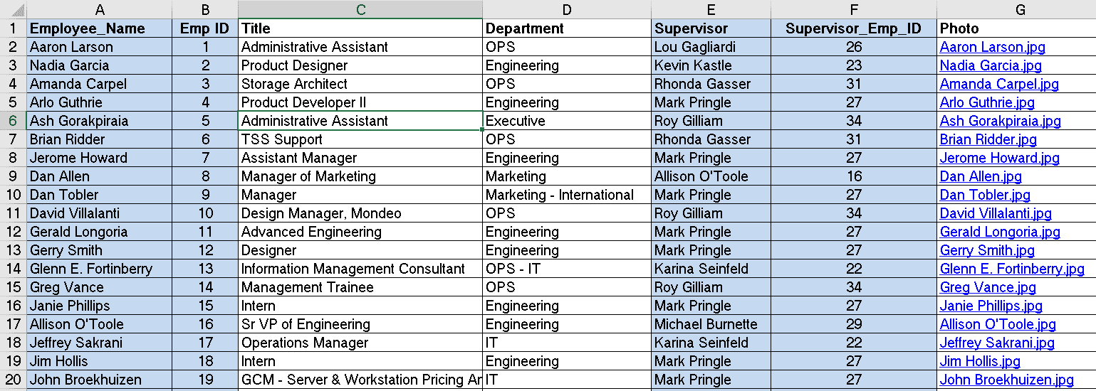
HR data is often kept in a range of systems and applications across an organisation, one of which are Excel spreadsheets. The Excel Connector in OrgChart Now pulls HR data from an .xlsx file. OrgChart Now also connects to a wide range of HRIS systems which can be combined with data from Excel to create org charts. The Excel source is common for appending data or creating quick charts. Appended Excel data, not residing in the main HRIS, may include information on contractors, open positions and future hires.
Data Reporting
Data in rows and columns is a suboptimal way to present metrics to make important business decisions. A single Excel spreadsheet rarely presents the whole picture on the numerous relevant KPIs involved in assessing a HR situation. With an org chart, not only can the structure of an organisation be displayed, but key metrics such as performance scores, salary and span of control can be added to personnel data to be assessed together.
Converting tables into meaningful visualisations is a slow and tedious process using Excel. OrgChart is specifically designed for the complex job of drawing, formatting, and publishing organisational charts from raw data. Once the entire process of creating org charts is automated, countless hours are saved from performing the task manually in Excel.
OrgChart can easily import Excel data to create charts and remains connected to keep it up-to-date. Chart formatting, data changes and personnel calculations are quick and easy. Charts can also be presented in a variety of formats including publishing to the company intranet, PDF or PowerPoint. They can also be broken down into departments and presented on different pages where decision makers can click through the chart interactively.
Excel data can be transformed into visually powerful org charts in both the cloud (OrgChart Now) and desktop (OrgChart Platinum) versions of our software.
OrgChart Now and Excel
Adding data from an Excel spreadsheet is as easy as setting up an Excel Connector in OrgChart Viewer; a read only interface for navigating, searching and exporting organisational charts. Simply sign into OrgChart Viewer and click on the Connector icon and select Excel from the panel. From there, browse for the files you wish to append or use to create the org chart.
Once the file is selected it’s simply a matter of configuring the mapping of the required fields. If the source file already contains the required fields, OrgChart will automate the mapping. Refresh and the chart is complete!
OrgChart Platinum and Excel
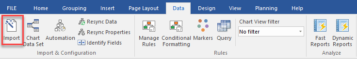
Import from an Excel file is by far the most common way to import data into our desktop solution, OrgChart Platinum. To create charts from data housed in Microsoft Excel go to the Data tab and click on the Import button.
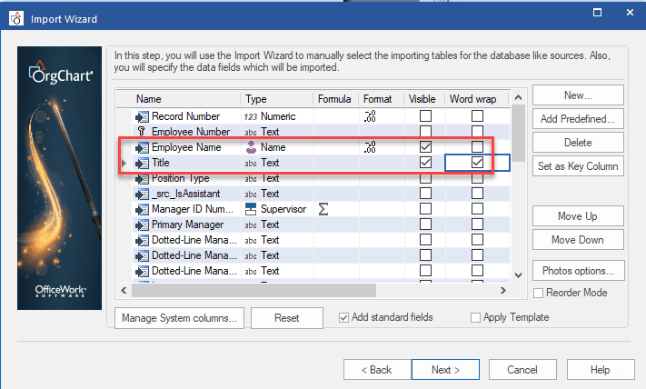
An Import Wizard appears where the sheet of the worksheet is selected from the available tables. The data to be visible in the chart are selected using a checkbox for each field.
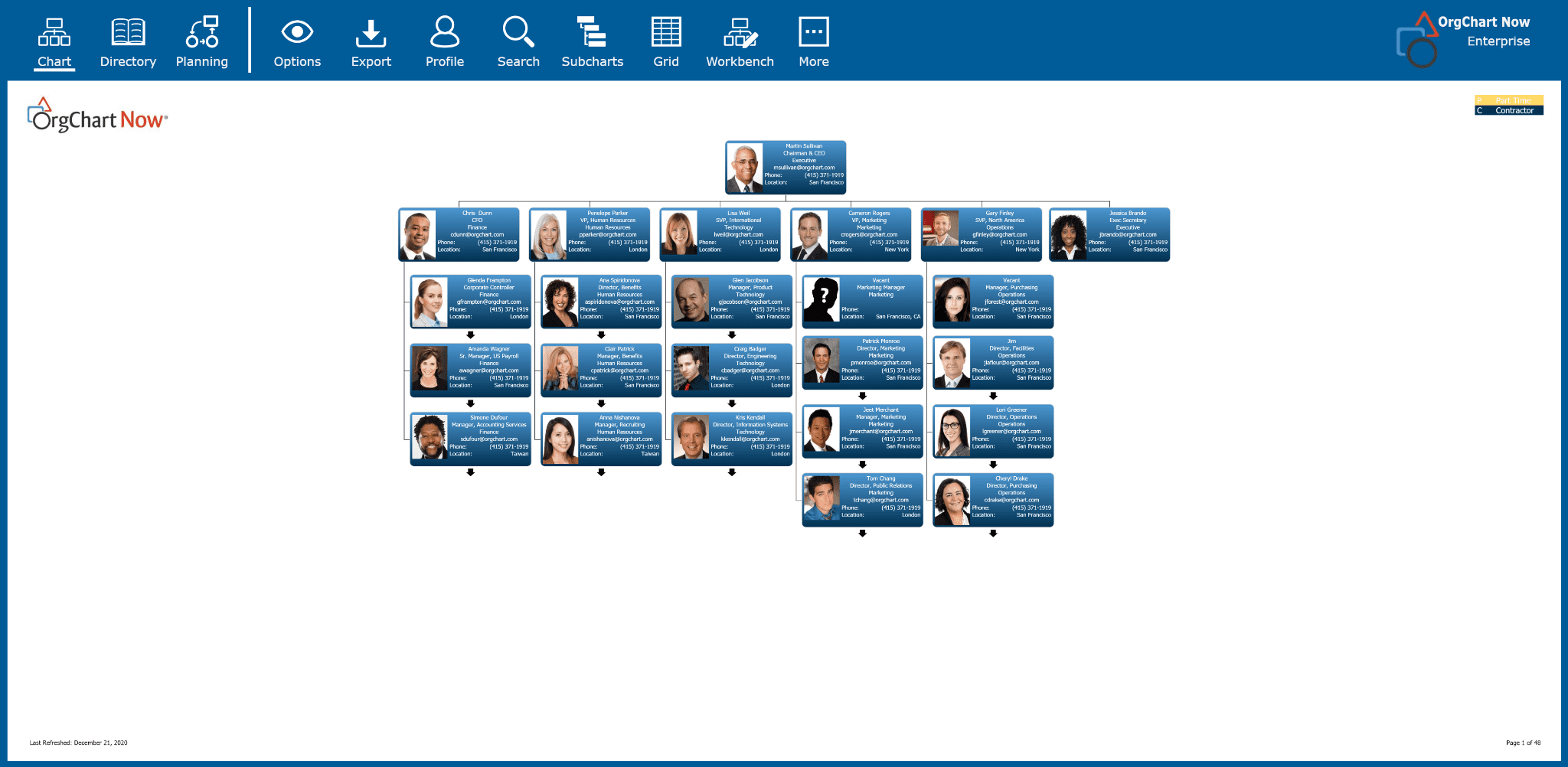
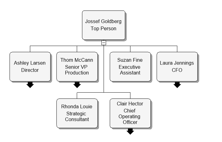
Once created, the chart can be interacted with to reveal other levels of management on new pages as shown in the example below.
After creating the chart, modify it with color, fonts and border styles.
To create org charts in a few easy steps from data you have data stored in an Microsoft Excel formatted sheet, contact our team of experts for a free demo, or download a trial of either OrgChart Now or OrgChart Platinum.

